Do you know how to create an image that captivates the user without the risk of ending up in spam?
Does the text or the image count more in the newsletter?
If you have ever created a newsletter before, you have certainly asked yourself this question. There is no single answer to this question, because the truth is that both are important, but you need to know when to give priority to one or the other, or - even better - when to integrate them together.
The choice depends mainly on the purpose of the communication (acquisition of new contacts, loyalty, direct purchase, etc.) and the target audience. It is not possible to plan a communication without considering these two aspects.
If we also have data from previous campaigns, we have an advantage because we can take into account the most successful elements of these with the aim of being able to replicate them in the new messages we are going to create.
Beyond these technical aspects, there is no doubt that the graphic component is very important within the newsletter because, if it is well constructed, it brings with it various advantages:
- it captures the user's interest immediately
- it allows to summarise complex concepts
- it facilitates the representation of data and statistics
- it allows to give relevance to the most important information
- it makes the message more pleasant to read
For all these reasons it is certainly preferable to use images instead of long blocks of text, which - in the eyes of the reader - could be boring and heavy to read. A text-only newsletter may be fine in cases where you have to give simple service information and are not interested in surprising, intriguing, in a word "conquering" the consumer.
In all other cases, the image will be a fundamental part of our marketing activity.
However, we must be careful not to abuse the use of images. In fact, basing an email marketing campaign solely on visual communication has a big risk: it could end up in spam.
This is because spam filters - which are designed to isolate messages that are considered potentially harmful or intrusive - often do not take graphic files into account and consider emails composed exclusively of images as empty. As a result, they are perceived as suspicious and end up in junk mail.
So how can you create the right image that will - at the same time - charm the user and not run the risk of being spammed?
In the following lines, we will give you some guidelines based on our practical experience.

Before we start, we want to give you some good news: you don't necessarily have to be a designer to create a striking image. Sometimes you just need to follow a few little tricks, and test them to see if they bring results.
But let's get to the point. Let's see how to create really high-performance - and spam-proof - images for your newsletter.
Choose the right image software
Surely the first thing to do is to identify a tool/app/software to search for images and/or edit them quickly.
In our experience, one of the most efficient tools for image acquisition is 123RF, which offers a wide selection of content that can be accessed by purchasing credit packages.
Other good alternatives, which also provide free images, are Freepik and Pixabay.
If, on the other hand, a predefined image is not enough for you, but you would like to create your own, perhaps with the addition of text and ad hoc effects, we recommend Canva. This is one of the tools most used by those who are not very familiar with design and with more structured tools such as Photoshop; it is very simple and intuitive and, even in the free version, you can take advantage of many features to create images of any size in just a few minutes, as well as videos, posters, banners, etc.
The advantage of using this software is that you do not have to deal with copyright issues because, unless you are dealing with special images, the content that can be downloaded through these tools can be used within your own channels, both for promotional and informational purposes.
In general, we recommend that you do not include images in your communications if you are not sure of their origin, as this could lead to copyright infringement.
Quality counts
Imagine receiving a promotional email with grainy or partly cut graphics. What would be your first reaction? Probably not a positive one, or at least not one that would encourage you to click on it and find out more about what that newsletter has to offer. That is why it is important to take into account the quality of the image when creating it. Check that it has a good resolution (there are also special tools to help you with this, such as Stickermule) and is visible in its entirety, so that no part of it is cut off from the screen. This connects to the next point.
Mobile first
Today, most digital interaction is done via mobile and more and more users are accessing their inboxes from their smartphones. For this reason, it is essential to ensure that your newsletters are mobile friendly, i.e. that they are clearly visible from a mobile phone. Linked to the above, we must be careful, when creating images, that they can be viewed in their entirety.
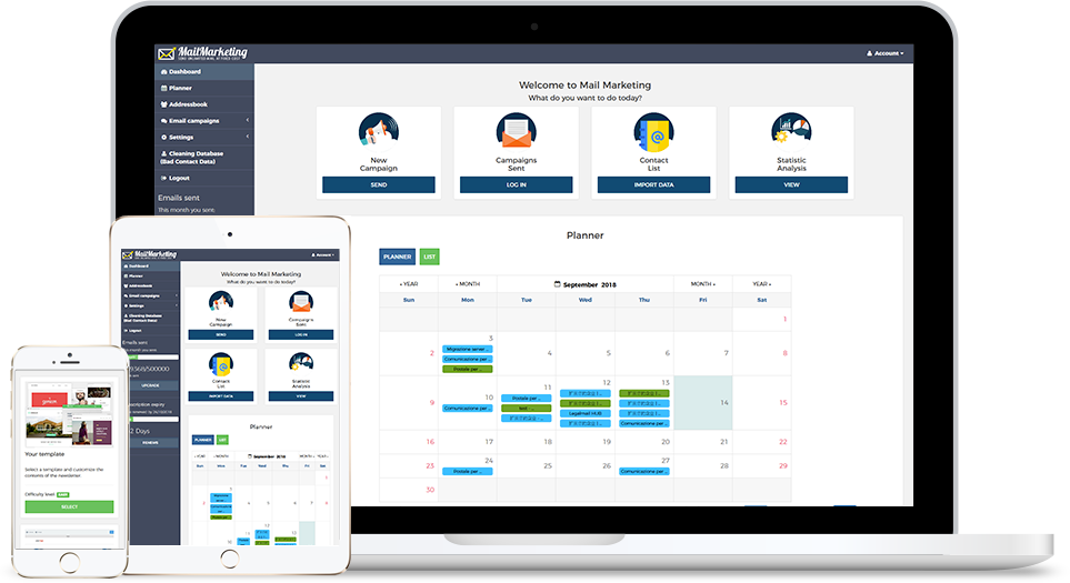
On Mail Marketing we give you the possibility to check how your email would be viewed on mobile: you can do a check in the "Content" section to the right of the template, when creating the newsletter.
Pay attention to the weight of the image
Since heavy images fatigue the email sending, so as to slow down the loading of the newsletter when it is opened by the user, it becomes important to pay attention to the size of each image.
On Mail Marketing it is not allowed to send newsletters that exceed 1MB in order to overcome the problem of not displaying the content of the communication.
In this regard, we would like to point out that there are many free online tools - such as Compresspng - for the rapid compression of images (whether in jpg, png or other formats).
Just consider that, in general, when the mail client fails to load the entire image, the recipient will see an alternative text in its place - called Alt Text - which replaces the graphic section in question and serves to describe its content. For example, if in our email we invite the user to download an ebook, the Alt text of the image could be "Download ebook".
We recommend that you always include this text portion when creating your newsletter. How? In Mail Marketing you can do this by writing the text in the empty field "Alternative text", which appears on the right when you click on the uploaded image. In this way - even if the original image does not load - the reader can still get an idea of its content through this small fragment of text.
This brings us to the end of this article. We hope you have found it useful and that you have gained some interesting insights for your email marketing activities. But we would also like our articles to be an opportunity for discussion and to lead to an exchange of ideas, so if you have other tips - that are different from those provided here - write to us: we would love to hear other voices on the subject!
We also want to remind you that, if you need support in setting up your campaign, you can contact us via the support section on our website or via chat on our Facebook page. Get in contact with us and we'll be happy to help!


