An almost imperceptible element, but of fundamental importance
What is the preheader
The preheader is that small text component of the email, decisive in terms of opening rates, click through rate (CTR) and conversions. It appears in the newsletter preview, immediately below the subject line, and serves as a completion to what is said above.
Because of its strategic position, it can be crucial in arousing the user's interest and induce him/her to discover the content of the message.
Despite this, many companies tend to neglect it and focus only on the subject matter, thus missing an excellent opportunity to make their communication appealing. Considering that the estimated number of e-mails sent every day is 93 billion, you better ensure that your message is not lost among countless others, but that - on the contrary - it captures the reader's attention immediately.
Beyond its strength in terms of strategy, there are other technical reasons why the preheader should be included in an email.
What is the preheader for?
Anticipate the contents of the message
As we said above, the preheader completes what it is said in the object, providing further details. Consequently, it performs an important function, which is to anticipate what it is written in the newsletter. We know that those who browse the web today often do so in a hurry, between coffee breaks. The amount of information is so large that we focus only on some of it, those considered most important and interesting. That's why the subject and the preheader should not be left to chance, but should provide the reader with an overview of what it will be discussed in the newsletter, taking care not to disappoint his expectations. Let us remember in this regard that it is essential that there is consistency between the information given in the preview and that one contained in the body of the message.
Facilitates mobile reading
Nowadays a lot of users open their inbox from their mobile phone more frequently than they do from a PC. In many cases in the mobile version the preheader is almost preeminent compared to the object, in fact it appears in full, while the object could be cut in half. Don't underestimate this aspect, on the contrary enhance it! Remember that the preheader need to be optimized also for mobile reading.
It supports those who can't view images
It may happen that some of the images in the newsletter are too heavy and therefore are not loaded correctly, or that some email clients block the display of the images. In the latter case, the reader should accept the view of the image and only then will be able to see its content. The preheader, on the other hand, has the advantage of being visible without the user's approval, so it can act as a substitute in case the images do not appear, since it already provides information about what is mentioned in the text.
Reduces the risk of spam
Every e-mail address has a reputation. Depending on how much the user perceives your communication as harmful or annoying, they may choose to mark the email as spam, and this is naturally counterproductive in terms of deliverability (=the ability of email to reach the recipients' inbox). In order for all newsletters to reach their destination, it is therefore useful to clarify the purpose of the communication right away, reducing the risk that the recipient will catalogue us as unwanted sender.
How to create an excellent preheader
Now that you know why you should value the preheader in your emails, we can move on to the next step: that of its composition. Again, we have some suggestions for you.
Customize the message
Addressing the user in a direct way, making his name explicit, can only have positive effects in terms of involving the target audience. For this purpose, the option, also present on Mail Marketing, "Insert Custom field" will be very useful, as it gives the possibility to create a dynamic field in correspondence of the contact's name (specifically, the field is {{Name}}), thanks to which the communication will be personalized for each single reader. If you include this field in the preheader, the recipient will perceive the message as addressed to himself and not to a general database of contacts, and as a result will increase the chances that he will be interested in what you have to say.
Don't repeat the subject line
First of all, it must be made clear that the preheader completes the object but does not replicate it. We have the opportunity to give additional information to what was said initially, so we should take great care not to repeat ourselves. For example, if you send a newsletter to communicate a new feature on your site (such as activating a payment method not initially planned), the first information - then the subject line - could be generic (e.g. "A new payment method is available"), while the preheader will be useful to give more specific information about that feature (for example, with reference to the subject line above, the preheader could be "You can use Paypal for your purchases").
Ask a question to stimulate the recipient's curiosity
In order to make the text eye-catching and attractive, a good technique may be to use an opening question that prompts the user to click on the email to find out more. If, for example, the goal is to promote a webinar about Google Analytics and/or other analysis tools, the subject could be "Join the Google Analytics webinar" while a good preheader could be "Do you know how to analyze your campaigns?
Insert emoji, emoticons and symbols
You probably already know that the presence of emoji and emoticons inside a text makes it more readable and informal, because it follows the communication style typical of chats, to which many of us are accustomed.
So why not use these symbols during the opening phase? If the tone of voice of our newsletter is friendly, an emoji in the preheader would certainly not only help to make the message light, but would also stimulate the reader's curiosity, as long as the symbol chosen is consistent with the theme.
Pay attention to the number of characters
Let's start saying that the amount of characters that can be displayed in the preview depends on two factors: the device from which the e-mail is opened (mobile or PC) and the e-mail client.
We have referred above to how mobile browsing has become more frequent in recent times; for this reason we should bear in mind that the number of characters that can be viewed from a mobile phone is on average 35, while if you browse from a PC you can preview up to 110 characters on average.
This also depends on the mail client: since one of the most used at the moment is Gmail, it is advisable to consider its standards of length when planning your communication, so as to correctly intercept the growing number of people who rely on Google's home email: in this regard we point out that the number of characters that can be displayed on Gmail ranges from 100 to 110, make the most of them! Be careful, because if you forget to insert the preheader, the first text elements in the email will automatically appear in its place, and not those carefully chosen in case it is included in the newsletter.
In the following tables we show you how much the preheader display changes in an email preview, depending on whether you are browsing from a PC or mobile and depending on the mail client/app used.
|
Desktop |
Preview Text Support |
Average of Characters Displayed |
|
Apple Mail |
✔️ |
140 |
|
Lotus Notes 8.5 |
❌ |
N/A |
|
Outlook 2003 |
❌ |
N/A |
|
Outlook 2007 |
❌ |
N/A |
|
Outlook 2010 |
❌ |
N/A |
|
Outlook 2013 |
✔️ |
35 |
|
Outlook 2016 |
✔️ |
35 |
|
Outlook for Mac 2015 |
✔️ |
35 |
|
Mobile |
Preview Text Support |
Average of Characters Displayed |
|
Android Native App |
✔️ |
40 |
|
Android Gmail App |
✔️ |
* |
|
Android Yahoo! App |
✔️ |
45 |
|
Blackberry |
❌ |
N/A |
|
OS Native App |
✔️ |
90 |
|
OS Gmail App |
✔️ |
50 |
|
OS Yahoo! App |
✔️ |
50 |
|
Windows Phone |
✔️ |
40 |
|
Webmail |
Preview Text Support |
Average of Characters Displayed |
|
AOL Mail |
✔️ |
75 |
|
Gmail |
✔️ |
* |
|
Yahoo.com |
✔️ |
* |
|
Outlook.com |
✔️ |
* |
|
GMX |
❌ |
N/A |
|
Web.de |
❌ |
N/A |
|
Freenet.de |
❌ |
N/A |
|
Mail.ru |
✔️ |
* |
* Varies depending on the subject line length.
Focus the main information in the first half of the message
Reconnecting with what was said in the previous point, it is important that every time you write the preheader, you do so also taking into account that - whether the user is surfing from pc or from mobile - the text could be cut after a certain number of characters. For this reason, the most important part of the message should already be contained in the very first words, to make sure that they are visible to the reader and therefore we can achieve our goal: to stimulate the curiosity of the recipient and encourage him to open the newsletter.
Include the Call to Action
Since the purpose of e-mail marketing is to bring the user to perform an action (such as purchasing a product but also downloading a pdf, subscribing to a registration form, etc.), it may be useful to insert a call to action in the preheader, for example "Download our catalog now" or "Try the new function X now". In this way not only the recipient will already know what to expect in the newsletter, but he will also be more inclined to open it knowing that he has the possibility to get a benefit from the proposals of our company.
How and where to put the preheader in a Mail Marketing newsletter
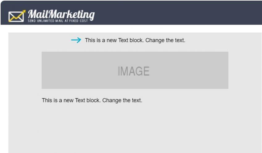
In case you choose to use one of the default Mail Marketing templates, the preheader can be included by replacing the default text from the very first section at the top (recognizable by the small font size).

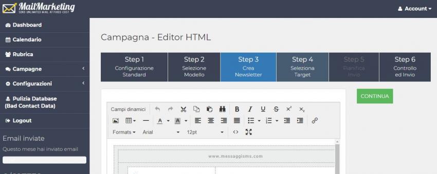
If you choose a custom template ("Do-it-yourself editor"), you should create a "Text" box at the top, where you can insert the copy designed as a preheader.
In this case it is not necessary for the text to be clearly visible to the reader inside the newsletter; in fact, it can also be small and almost imperceptible, because remember that the goal is to fill the text section that comes immediately below the subject line so that it is visible in the preview of the email, not inside the newsletter itself.
Now it's your turn! Create your newsletter and insert the preheader as the first information in your template. Should you have any doubts/difficulties of any kind, or should you notice any anomalies and have any suggestions to give us to improve the platform, you could just contact us via email at [email protected] or via chat on our Facebook page: we would be happy to hear your opinion and discuss it with you.


