Colourful, fresh, innovative ideas and lots of inspiration from other brands
With the arrival of spring, a new season starts for your marketing activities. The days are get longer, the weather gets nicer and, inevitably, consumer needs change.
This is a good reason to review your strategy and renew your communications on various channels, such as newsletters.
First of all, you need to think about which products/services are best suited to the customer's needs in these months and how to refresh your newsletters both from the point of view of design and from what concerns text.
We have lots of ideas, which we cannot wait to share with you, also taking inspiration from some newsletters of different brands, related to various sectors. Ready? Let's get started.
Subject: Freshness and lightness as key words
As you know, the first element in the newsletter to which the recipients are exposed is the subject line. And it is also the one that leads the user to open the email and view its content. This is why the subject line is so important and it is essential that it is consistent with the message being conveyed. In the case of spring, we advise you to create a subject line that refers to the current season, also in terms of the lightness and freshness that this time of year generally conveys.
A good idea would be to use themed emoticons, such as flowers or the sun. If you have any promotions planned, highlight them immediately in the subject line. For example, assuming you want to offer a 40% discount on certain products, your subject line could be "Super spring discounts! For you -40%".
Create a theme template
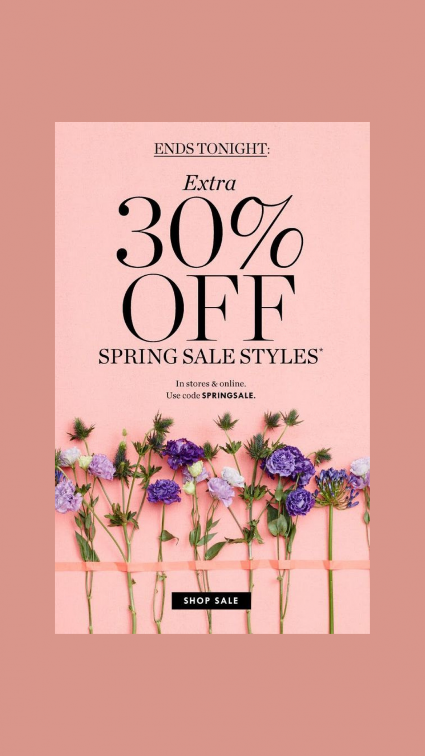
Let's move on to the body of the email: what should the template look like? We have said that it's important in times like these to renew the graphics, using colours and decorative elements that recall spring. Generally, we prefer to use pastel shades, which are lively but not too strong, as in the case of the brand J.Crew:
On Mail Marketing you have many predefined templates to choose from: among the categories you can find travel, ecommerce, real estate and many others.
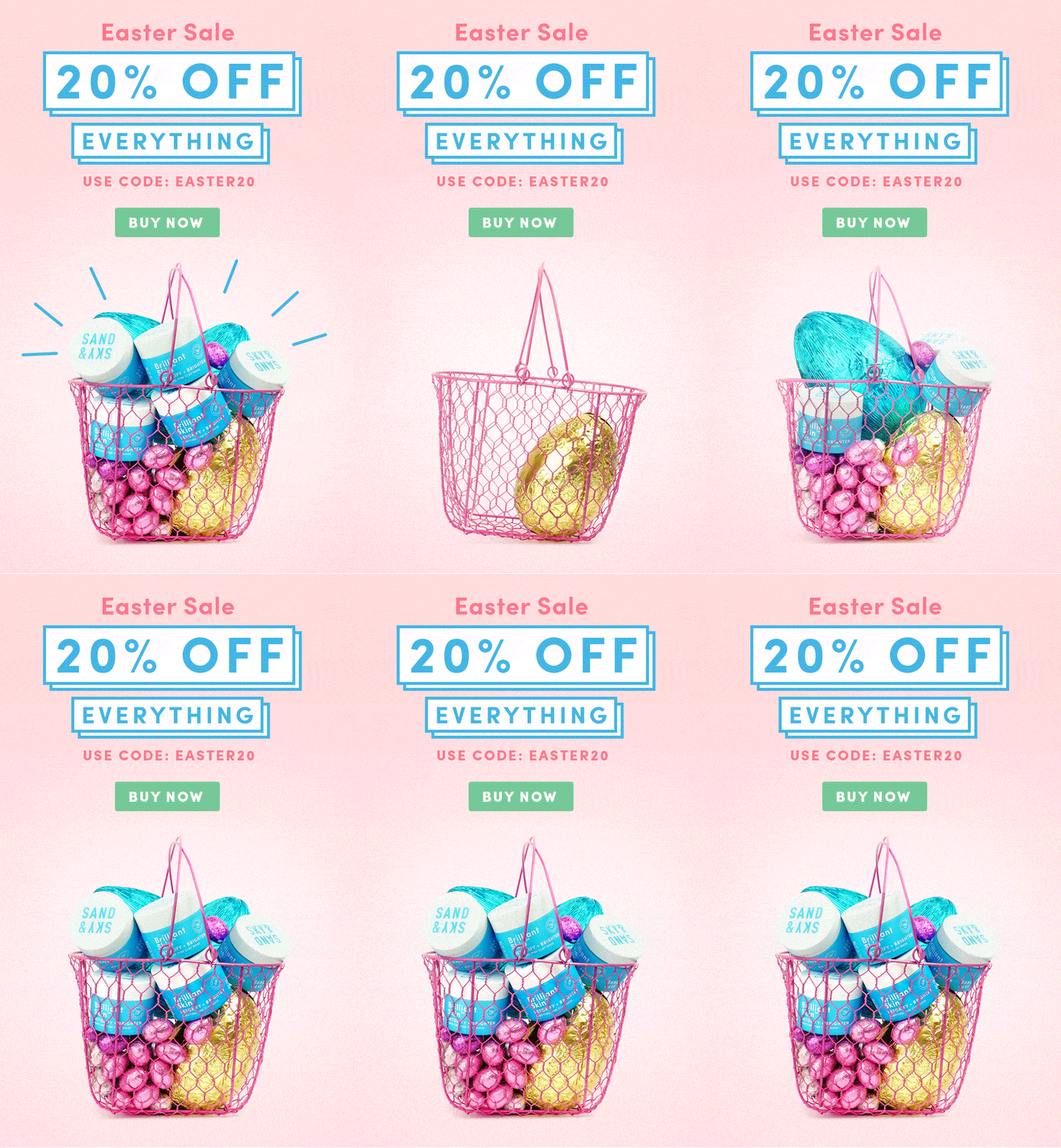
The floral theme is certainly one of the most common, because it best expresses the essence of this season. To make the communication more interactive, test small videos or animated gifs in addition to the static image. Here you can find a clear example, from a newsletter of Sand & Sky (Easter 2020):
Pay attention in giving the right space to the different components of the email. Image/videos and text should be sufficiently spaced so that the eye can easily distinguish the different elements. It is also important that the primary sections of the message are highlighted using a larger font and a different colour, unlikely the rest of the text.
Test new CTAs
And don't forget the Call To Action! All newsletters should always contain a call to action, which we recommend you incorporate into a button that is large enough and clearly visible by using a colour that stands out from the rest of the text.
If necessary, and if the newsletter is long enough, you can also consider including more than one button in the same communication. Again, we suggest you try new CTAs for your spring communications, and verify their effectiveness in the post-sending phase, considering the click-through rate on the email. On Mail Marketing, you can do this analysis through the Statistics section, which is available for all sent campaigns.
Highlight products relevant to the season
Are there any products or services your company offers that are best suited to the spring season? In the case of a clothing brand, the answer is fairly obvious, because it is clear that collections change according to the season.
But we could say the same thing for many other sectors. Conduct an analysis, also through ad hoc keyword research, of what users need in this period, to understand if you can meet their needs.
That's not all. If you have been working in your company for several years, it is certainly useful to carry out a study of past years' sales in this same period, to understand the trend of the season.
Of course, you will have to take into account the fact that consumers' needs and habits have changed this past year due to the pandemic, so the requests of two years ago may not be the same as they are now; this is the case for travel/transport companies, who certainly have to bear in mind the fact that people are less free to move around at the moment.
For example, it is fundamental to guarantee a free seat next to each passenger, so that there is the right distance between people. If your company does it, communicate this info to online users, as it will let people know that you follow all the main hygiene rules.
Similarly, if you have a physical point of sale, you should specify that your shop cares about compliance with health regulations, so for example that sanitising gel is available at the entrance, that a distance of at least one metre is guaranteed, etc.
Your newsletter as a (mini) catalogue
Do you have a new spring collection to offer? Are there lots of new products available on your ecommerce site and you can't wait to show them to your contacts? As well as referring users to your website so that they can choose their favourite products from those available, you could also consider including a preview of your catalogue in the newsletter itself, starting from the most popular product category. Of course, inserting them all would be complicated because the newsletter would become very long, so the solution is to opt for a mini-catalogue, which can give the reader an idea of what to expect on the site. An example? This newsletter from the brand Sasy fashion:
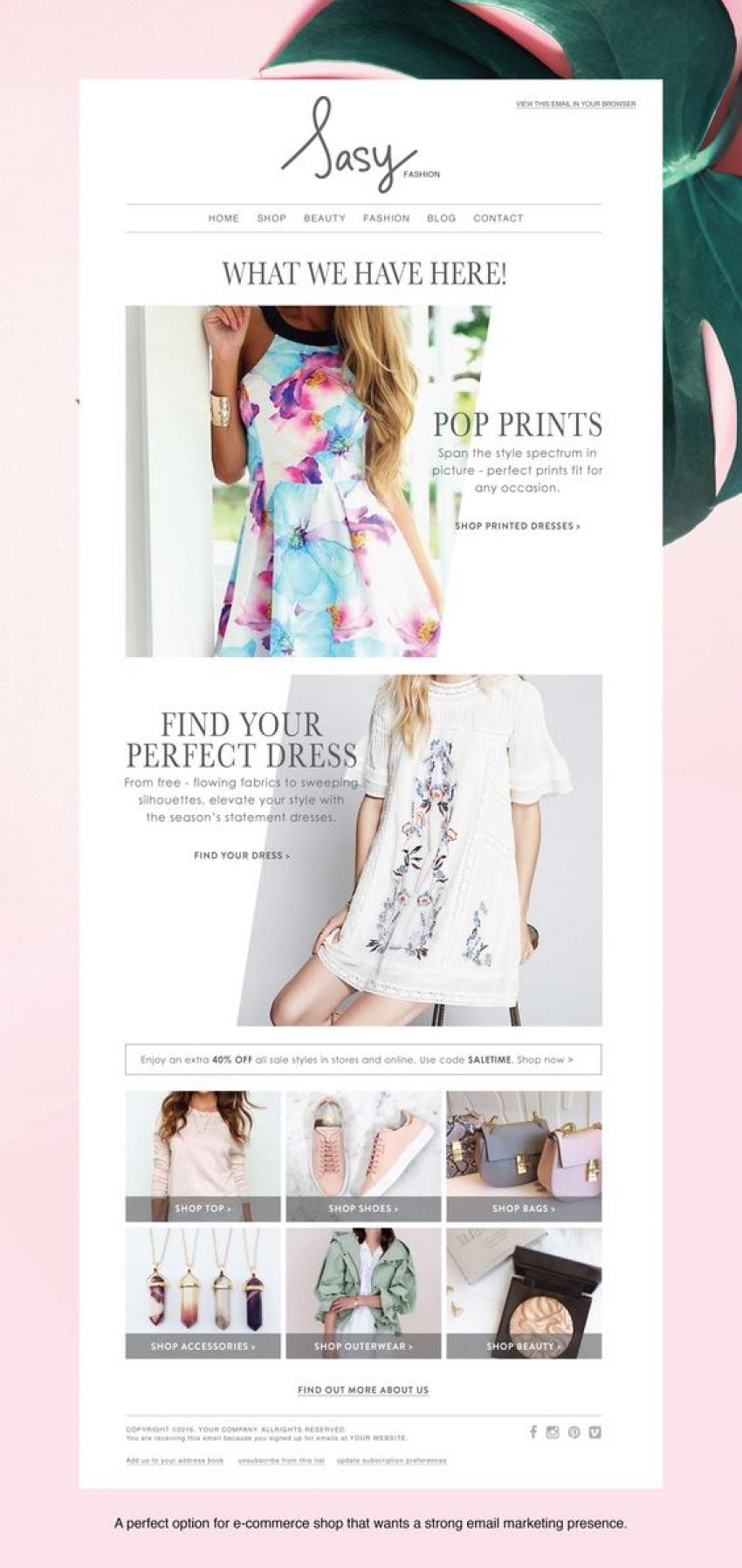
Of course it is important that the newsletter is well organised graphically and that there is the right spacing between one product and another, so that it is easy to identify the most interesting proposals at a glance. Each new proposal should contain a direct link to a landing page that contains details about that specific product.
If you do not have an ecommerce but would like to invite users to come and discover the new collection in the shop, you can insert photos of the new proposals and invite your contacts to try them out in person in the shop.
Organise a Giveaway
Another effective way of attracting the attention of users, but above all to make them participate, involve them actively and make them contribute to introducing your brand to other people, is to organise a giveaway on social media, which you can communicate on the various channels, including your newsletter.
The idea is simple: choose a special spring product, a gift box or an unmissable voucher and invite people to participate by first liking your social page - e.g. instagram - and asking them to perform certain actions (e.g. like the post, tag three friends, share the post in their stories). Keep the contest active for a number of weeks (at least 1 month is recommended), at the end of which you will draw a winner.
An email inviting users to take part in the giveaway will ensure that even those among your contacts who don't yet follow you on social networks start to do so and, above all, that the followers of your contacts become aware of your brand. Obviously, you should propose something really interesting for the user, so that they will be happy and motivated to participate.
Include spring festivities
Another opportunity to take advantage of is the occasions and festivities associated with spring.
First and foremost Easter. Actually, we are almost there! Next Sunday is Easter, have you sent out a communication to your contacts database informing them of the possibility of purchasing themed products/services, or of requesting home delivery of lunch if you run a restaurant, for example, to book a session at your beauty salon as soon as it reopens?
If you haven't already done so, do it now! No more time to waste.
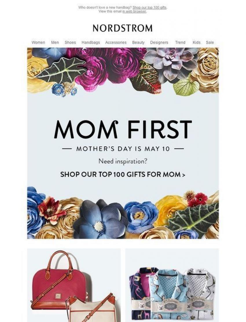
There is also another festivity that should not be underestimated: Mother's Day. This year it is celebrated on 9 May, so you have enough time to plan your communication in advance. However, we advise you not to let too much time pass, but to launch your communications as soon as possible.
Let your imagination run wild and come up with lots of ideas for original gifts. An example of a newsletter is that of the brand Nordstrom, which we show you here:
If you are looking for inspiration for your newsletter, we invite you to read the article we wrote last year, which you can find at this link.
We hope we have given you some good suggestions for your spring-themed communication.
We remind you that if you need support for your email marketing campaigns, we are available through the form on Mail Marketing website or through our Facebook page. Contact us, we'd be happy to help!
Well, it's time to start! Reorganize your ideas and write now your newsletter.

